
A Trusted Name. A Bigger Mission. A Clearer Message.
“The updated logo, expanded color palette, and appealing, user-friendly website helped bring WCF into its next chapter. The finished brand feels like an evolution of who we are, while preserving what people recognize about us. It gives us a presence that reflects the scope and quality of our work. As I’ve described it, it feels like we’re in the big leagues now!”
– Angela McGraw, CEO, Women & Children First
A Trusted Shelter Was About to Open Something New
For nearly 50 years, Women & Children First (WCF) has helped domestic violence survivors and their families find safety, strength and hope.
When we started working together, WCF was preparing to open Arkansas's first Family Peace Center. This $24 million project would expand shelter capacity from 54 to 132 beds, add pet kennels and bring critical services together under one roof.
It was a huge milestone. But WCF's brand and messaging hadn't kept up with its growth.
Several names were being used to describe the organization, the new center and its capital campaign. Each made sense internally, but I could see how confusing they might be to someone unfamiliar with WCF.
And when someone is experiencing domestic violence, confusion can become a barrier to getting help.
WCF needed more than a new look. It needed one clear, trusted identity that reflected its future without losing its past.
Three Things We
Got Clear On
02
Start With the Person Who Needs You Most
This was one of the most important decisions we made.
Donors, partners and community leaders mattered, but our first priority needed to be someone experiencing domestic violence who might be frightened, overwhelmed or unsure where to turn.
We organized the website around two clear paths: Get Help and Give Help. We made the 24-hour hotline easy to find and used simple, compassionate language to explain available services.
One message became especially important: "You don't have to stay with us to get help from us."
WCF was much more than an emergency shelter. We needed people to know they could access counseling, advocacy, safety planning and other services without staying there.
01
Build on the Trust You’e Already Earned
At first, this looked like a traditional branding project: update the logo, build a better website and create new marketing materials.
But my Key Insights process revealed a bigger opportunity.
WCF had spent nearly 50 years earning the community's trust. Why start over?
I recommended keeping Women & Children First as the primary brand and positioning the Forest of Hope Family Peace Center as part of its expanded services.
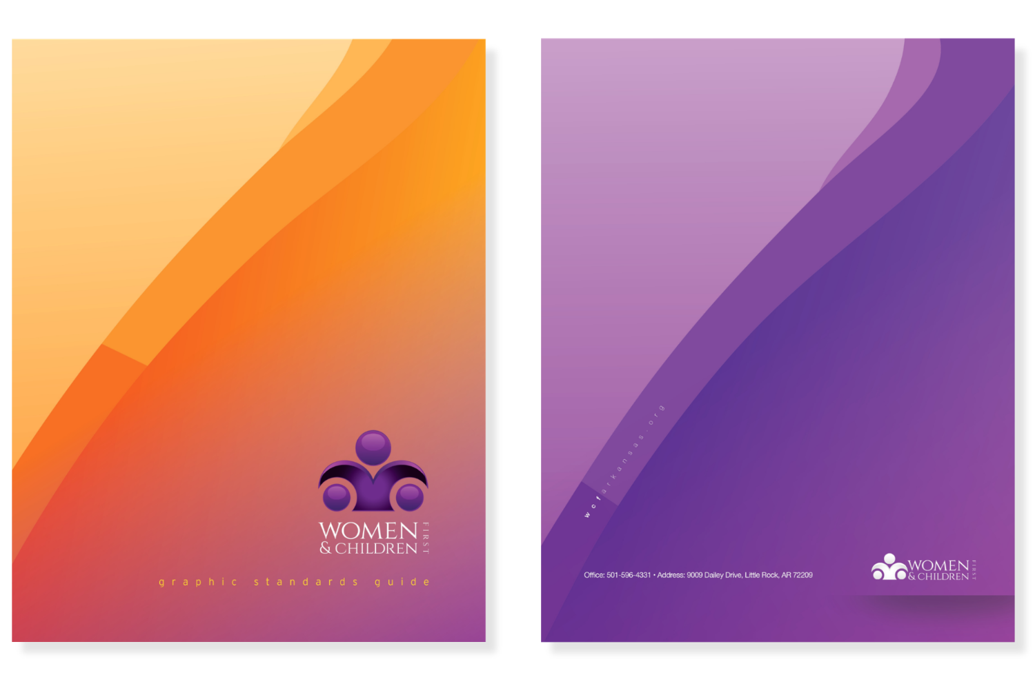
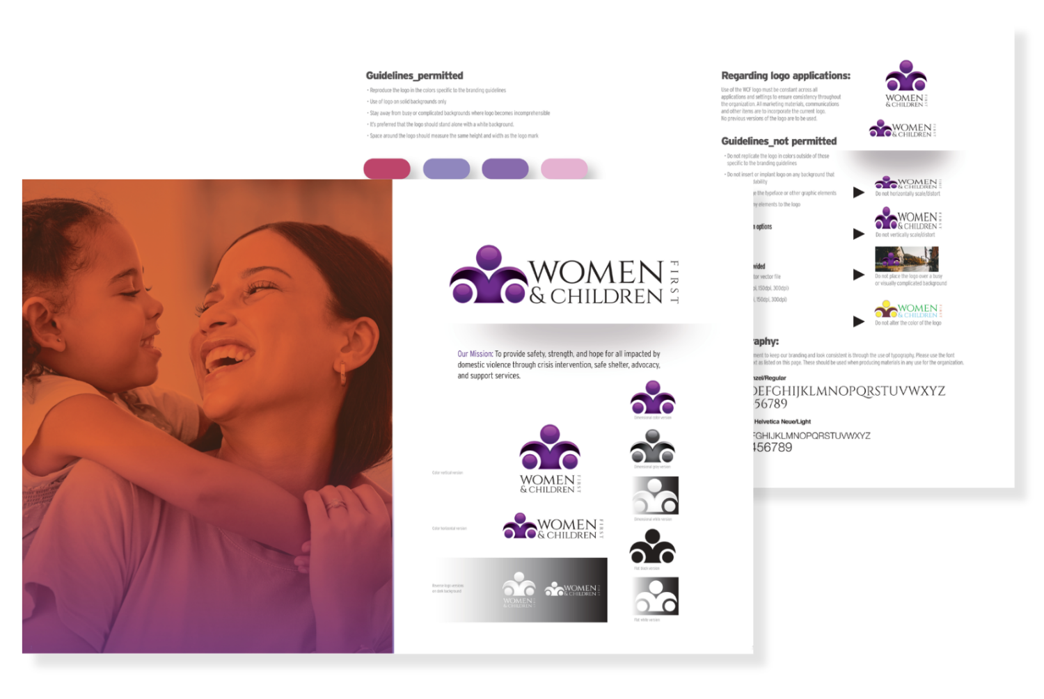
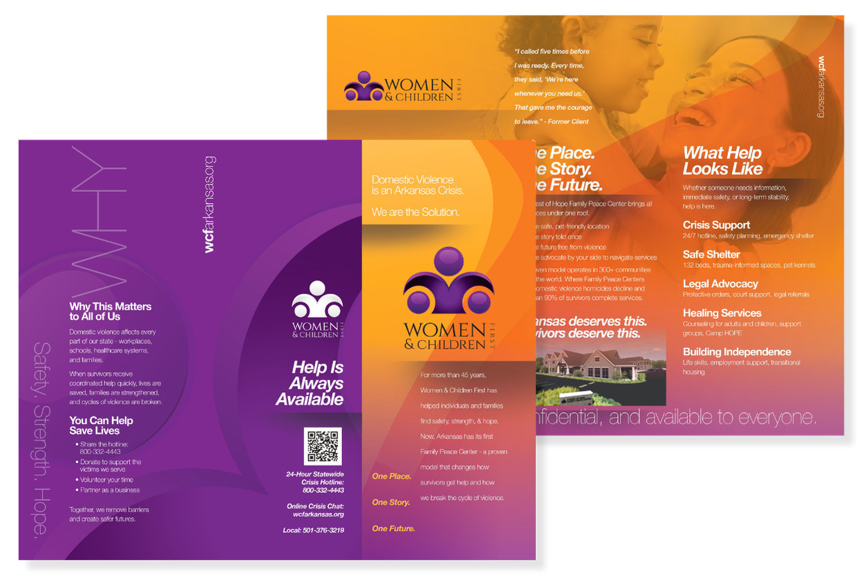
We refreshed the visual identity and created consistent messaging and marketing materials that brought everything together.
The goal wasn't to reinvent WCF. It was to help the brand reflect the organization it had become.
03
Keep the Conversation Going Beyond Opening Day
A ribbon cutting is a wonderful milestone, but I didn't want WCF's story to end there.
I developed an integrated communications strategy to introduce the Family Peace Center, educate the public and position WCF leadership as trusted experts.
We pitched stories, prepared leadership for interviews and developed news releases, blogs, newsletters and social content.
After the center opened, we shifted the conversation from celebrating the building to explaining how people could actually get help.
The goal was never just publicity. It was awareness that could make a difference.
Clarity Came Before the New Look
I know how hard it is to see your own organization objectively. You're so close to the work, putting your heart and soul into what you do, that sometimes you don't realize your brand hasn't kept up with how much you've grown.
That's why I start by asking questions, listening and looking at the bigger picture.
Sometimes the answer isn't a new logo, website or more marketing. It's getting clear on who you are, what makes you different and how to connect with the people who need you.
Great work doesn't speak for itself. That's your brand's job.


From several names to one story and seven months of coverage
Brand Strategy & Key Insights
Unified the brand around the trusted Women & Children First name.
Brand Messaging &
Website Control
Created clear, survivor-focused messaging and simplified the website around Get Help and Give Help.
Brand Refresh &
Marketing Materials
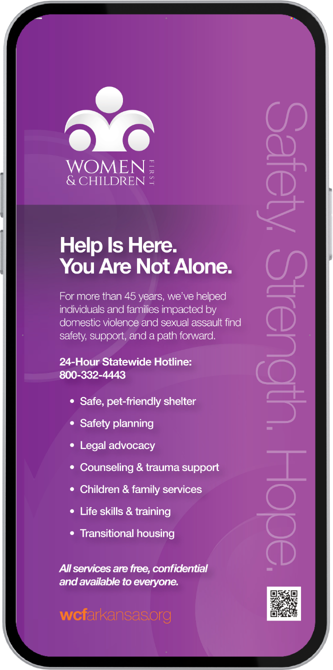
Developed a cohesive visual identity and branded materials, including brochures, rack cards, banners, trade show displays and business collateral.
Communications Strategy &
Media Relations
Generated 27 documented media placements across 12 media brands from April through October 2026, with approximately $300,000 in estimated earned media value and seven months of coverage across TV, print, radio, podcasts and digital media.
“Closing Testimonial Lorem ipsum dolor sit amet, consectetur adipiscing elit, sed do eiusmod tempor incididunt ut labore et dolore magna aliqua. Ut enim ad minim veniam, quis nostrud exercitation ullamco laboris nisi ut aliquip ex ea commodo consequat.”
– Customer Name, Title, Organization

Ready for your own organization’s brand to catch up with its growth?
If your work has grown faster than the way people understand it, this is where I would start.